CITI IDENTITY
Brand Identity
Art Direction
Graphic Design
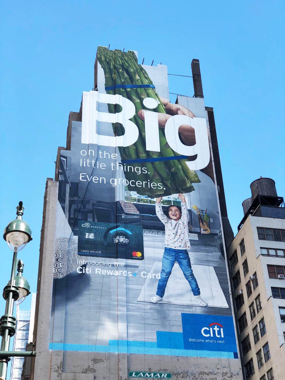
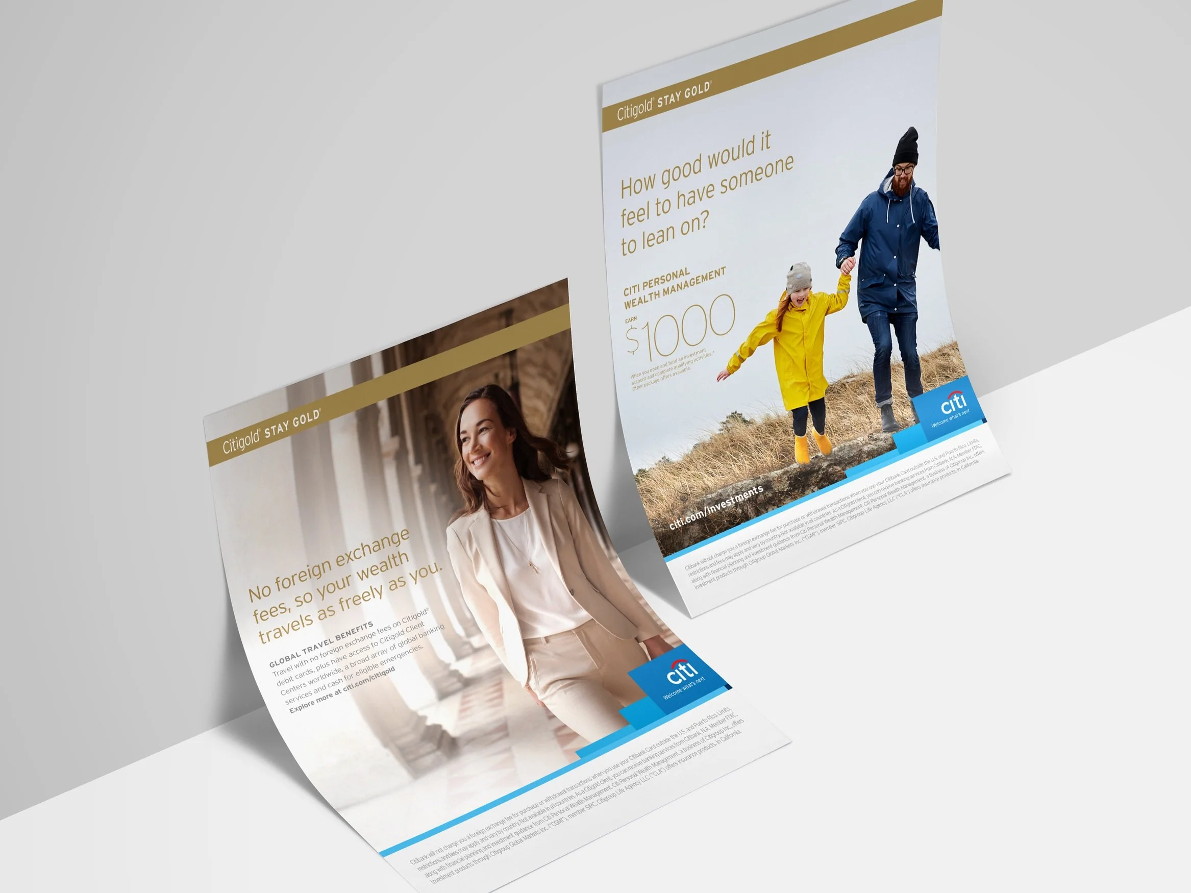
OOH
Social
Digital
Guidelines
Following an in-depth review of Citi's decade-old branding, a new design language was created to provide a dynamic evolution for one of the world's top financial institutions.
The previous system centered around a striking blue gradient, known internally as the Blue Wave, was primarily designed for print communications. However, this template's flexibility proved inadequate for digital applications and led to inconsistencies when adapted to the brand's diverse global markets.

Following a thorough review of Citi’s decade-old branding, a new design language was developed to address the previous system's shortcomings and act as a dynamic evolution for one of the world's leading financial institutions.
The new approach needed to be flexible and forward-thinking while staying true to its roots. By breaking down the gradient and identifying five core blues, the brand can now showcase Citi's many facets in an easily communicable way and adaptable for a constantly evolving digital landscape.
Combined, the five-core blues replaced the Blue Wave as Citi’s global branding device.